
Plum and Olive Wedding Color Palette Ideas: Three Table Directions
Explore a plum and olive wedding palette with light linen, olive-led settings or wood tables, plus sample checks and readable stationery choices.

By Emma & Ella FrostUpdated November 16, 2026
5-Ingredient Dump & Go Crockpot Meals
101 effortless slow cooker recipes for busy families.
View on AmazonAvailable on AmazonPlum and olive can give a wedding table a rich color contrast without putting a dark color on every surface. Choose one place for the plum to stand out, one repeated olive detail and a quieter base that leaves the table readable.
The three directions below are styling proposals, not photographs of real weddings or a claim about the season's most popular palette. Use actual samples in your venue before ordering several materials that share the same color name.
Start with the venue's existing colors
Look at the floor, chairs, walls and table finish before choosing a cloth. Olive beside warm wood can look different from olive beside a gray floor. Plum can read as reddish, purple or nearly dark brown depending on the fabric and lighting.
Bring small linen, paper and ribbon samples together. Compare them in daylight and under the lighting planned for the reception. A supplier's screen image is a starting point, not proof that different products will match.
Write a simple brief naming the actual sample or supplier color, not just green and purple. Share it with the people choosing linens, stationery and flowers so each decision supports the same arrangement.
Try a light base with plum napkins
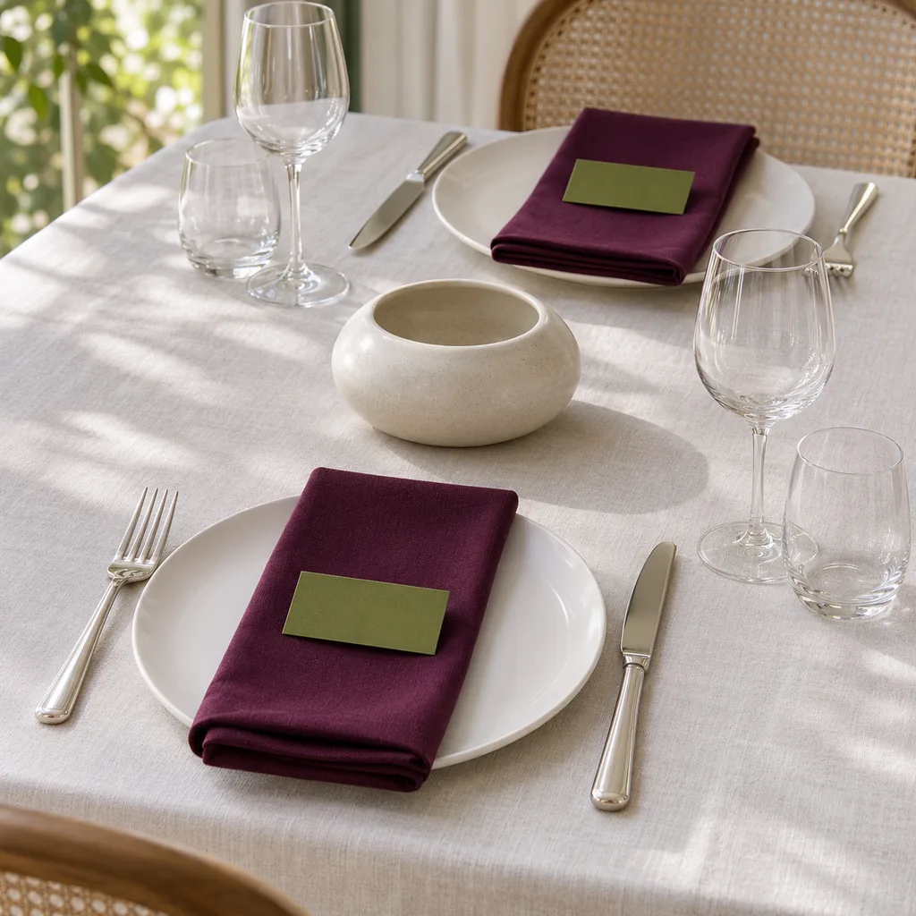
For a restrained version, use a light table covering and plain plates, with plum napkins as the main color. Repeat olive in a modest stationery detail or another removable table accent. The contrast stays visible without requiring colored glassware or a second patterned linen.
Set out one complete place before repeating it around the table. Check whether the folded napkin hides the menu, whether a place card can be read and whether the accent competes with food and serving dishes.
Keep decorative ribbons and materials separate from eating surfaces. Use tableware intended for the meal, and follow the venue's rules about what may be placed or attached to tables. A color match does not establish that a decorative object is suitable for food contact.
Let olive linen lead a richer table
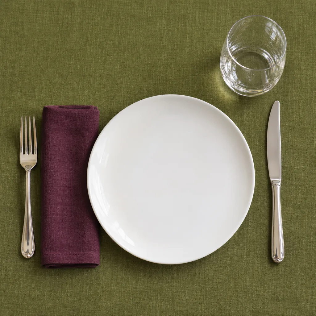
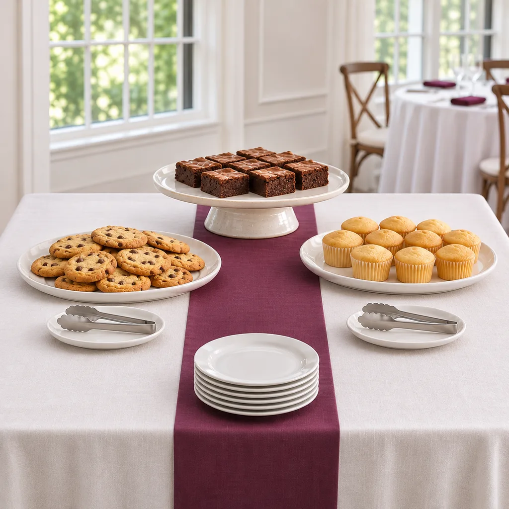
An olive cloth can carry more of the palette when the room needs a stronger base. Use plain plates and a smaller plum detail, such as a napkin or paper accent, so the two colors do not compete at the same scale.
Texture can supply variation: a matte napkin beside a smooth plate looks different from a glossy ribbon. Compare the actual materials together rather than assuming every olive object belongs in the same setting.
If the first sample feels too dark, change one large element before adding more accessories. A lighter cloth or plain napkin can make the palette clearer. Do not solve an unclear combination by buying another shade.
Use the colors as small accents on a wood table
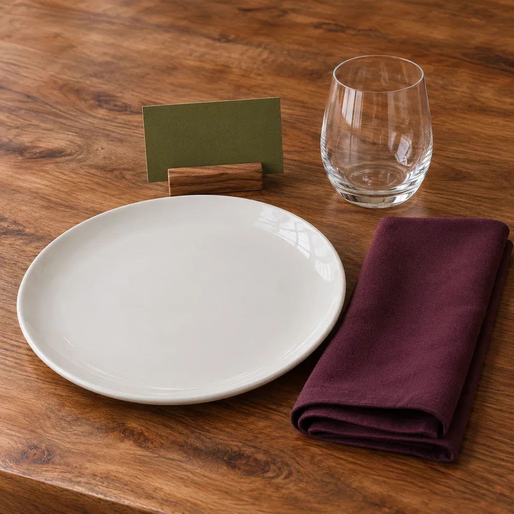
Where the venue permits uncovered tables, let the wood remain visible and use plum and olive in smaller repeated pieces. A napkin, place card and one low removable decorative object may be enough to connect the settings.
Keep the center available for the actual service plan. A family-style meal needs space for shared dishes; a table served by staff still needs a layout they can work around. Ask the venue or caterer to review the arrangement before finalizing a decorative runner of objects.
The small-table decoration guide offers a related way to think about place settings and serving space. Its household examples are not a reception capacity calculation.
Translate the palette into useful paper details
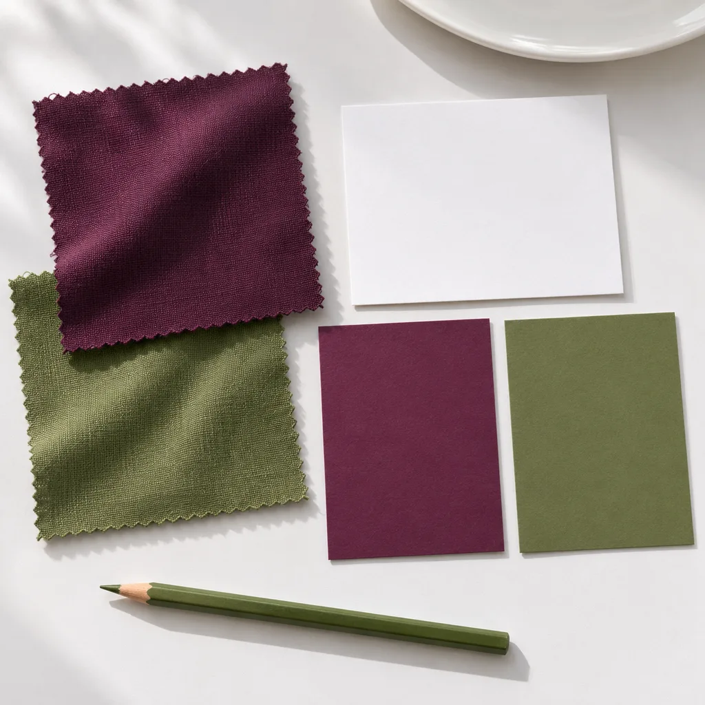
Keep text readable rather than matching every line to the darkest linen. Compare a printed proof of the names and menu under the intended lighting. Small olive lettering on plum paper may look coordinated on a screen yet be difficult for a guest to read.
Use the colors for a border, heading or backing if plain text gives a clearer result. Spell out food information accurately; decorative wording should not obscure the menu or a guest's dietary question.
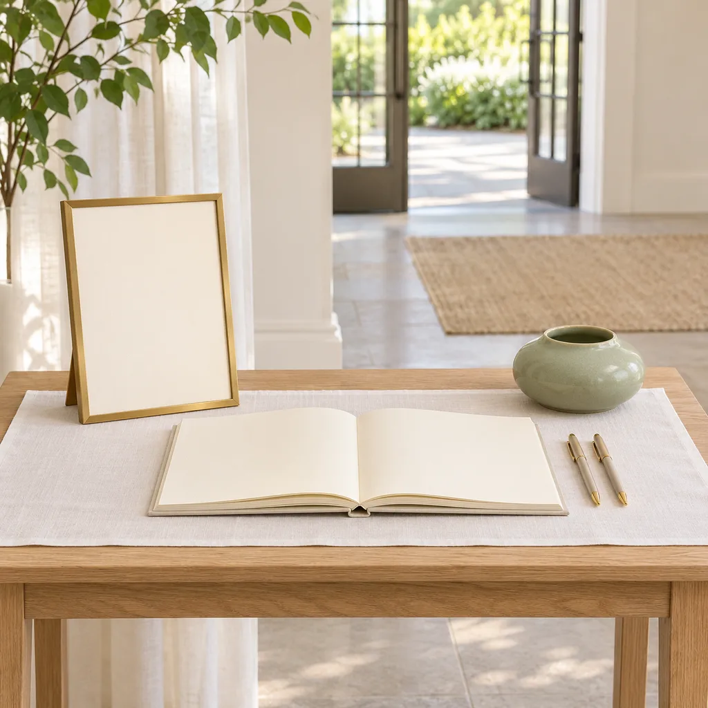
For arrival stationery, the wedding welcome-table guide addresses the separate job of helping guests find information. Repeating a small palette detail can connect the spaces without duplicating every table decoration.
Finish with a sample and a packing record
Photograph one approved sample arrangement for setup reference, then list the pieces it actually uses. Note who supplies each item, what must be returned and which substitutions need approval. This is more useful than sending several inspiration pictures with different interpretations of plum.
Leave any floral selection to a documented plan with your florist and venue; a palette name does not identify a plant or make it suitable beside food. This guide does not provide structural installations, hanging methods or candle arrangements.
Choose the version that suits the room and service: light with plum accents, olive-led, or smaller details on wood. A consistent role for each color makes the palette feel deliberate without turning every object into part of a matching set.
Keep good recipes close
Add The Cooking Twins to your preferred sources on Google for more easy dinners, no-bake desserts and kitchen inspiration.
Emma & Ella Frost
A practical resource from The Cooking Twins.
More from Emma & Ella Frost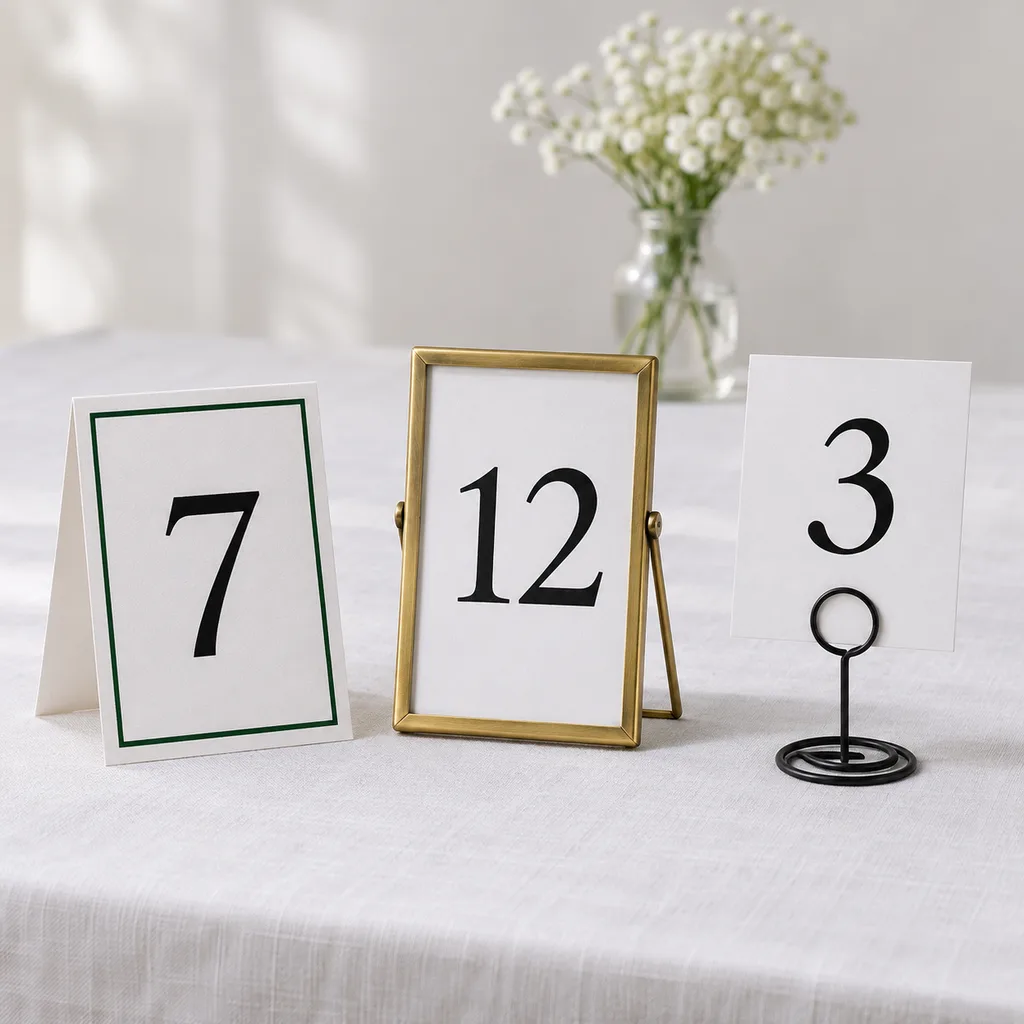
Comments
Leave a commentShare your question or planning tip below.